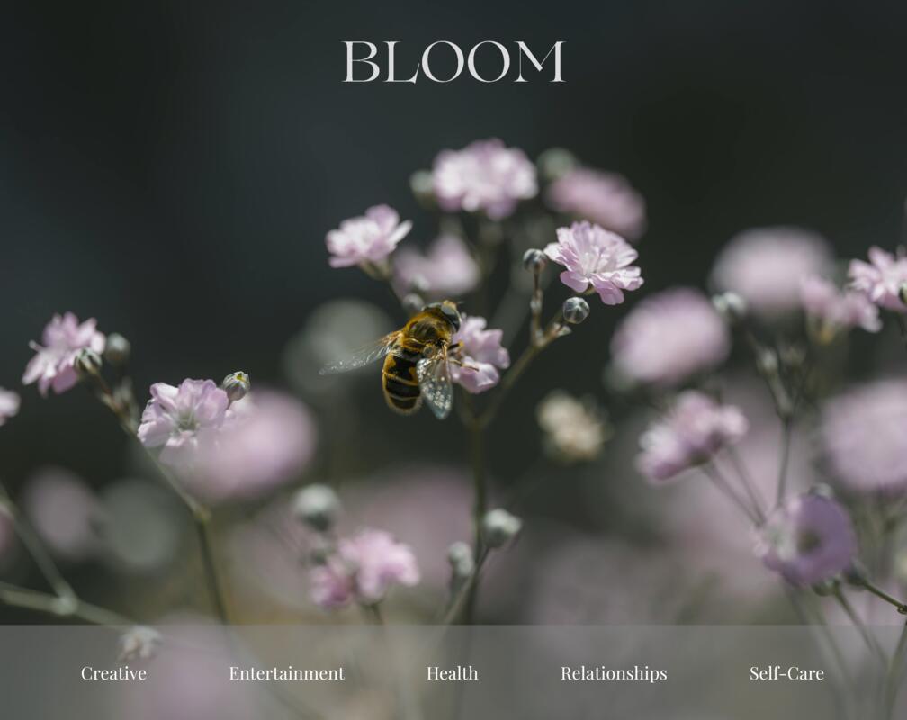
Bloom Lifestyle Blog
The aim: Modern, Clean, and Inspiring
A responsive blog platform focused on lifestyle and self-care.
My Role in the Project
The Bloom Lifestyle Blog was developed as part of my final exam for the FED year 1 program. The exam brief required the creation of a fully responsive blog platform that integrates dynamic content through an API and provides both a public-facing interface and admin features. I was responsible for every aspect of the project, including:
- Design and Branding: Using Figma, I created high-fidelity wireframes and a style guide to establish the aesthetic and branding of the site. I also created the logo and other visual elements in Canva.
- Front-End Development: I implemented the front-end using HTML, CSS, and JavaScript, ensuring a responsive and accessible design that works across all devices.
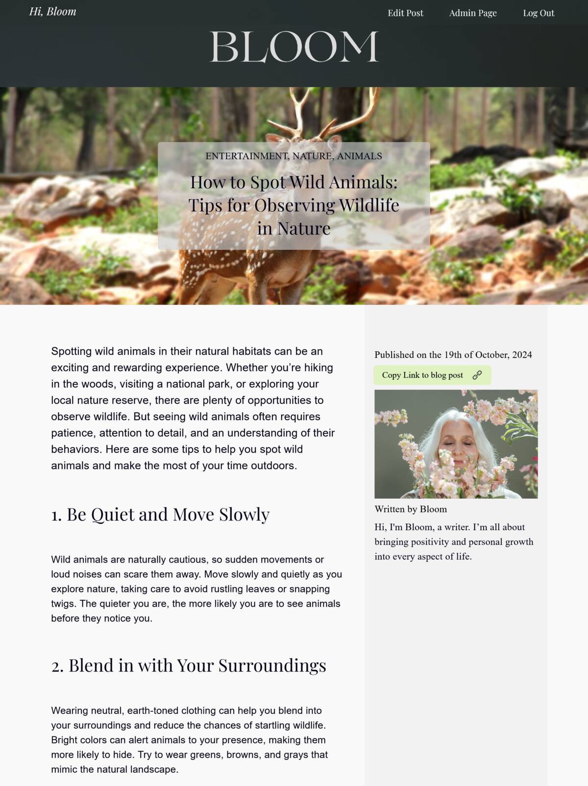
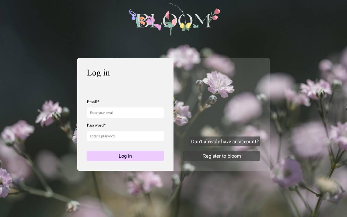
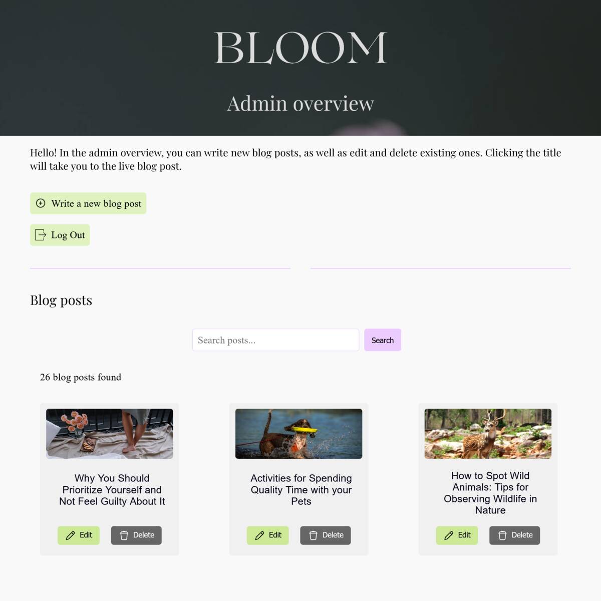
- Admin and User Features: I developed an admin page that allows the owner to create, edit, and delete blog posts. Users need to register and log in to access this. I integrated TinyMCE for post formatting, ensuring user-friendly content creation.
-
Testing and Accessibility: The project underwent extensive testing, including responsiveness, performance, and accessibility. I followed WCAG guidelines and used ARIA attributes to ensure that the site is accessible to users with disabilities, including screen reader support. Testing was also conducted across multiple devices and browsers to ensure a consistent and inclusive user experience.
- Deployment: I deployed the project on Netlify, handling the version control via GitHub. The site is live and fully functional.
This project allowed me to practice managing a full development lifecycle, from planning and design through to implementation, testing, and deployment.
Technical Challenges
-
API Integration for Dynamic Content: Managing API requests and asynchronous data flow involved creating reliable error handling and ensuring performance stayed optimized while dynamically fetching blog posts.
-
Responsive Design Across Devices: Designing a layout that adapts to mobile, tablet, and desktop devices required mastering CSS media queries and flexible grid layouts, especially ensuring the carousel worked flawlessly on all screen sizes.
-
Secure User Authentication: Implementing secure login and logout features was crucial, especially handling user sessions and preventing unauthorized access to admin features while ensuring a smooth user experience.
-
Loading Screens and Preloading: Implementing custom loading screens and using preloading techniques for assets ensured a smoother user experience by reducing perceived load times. This approach helped maintain a polished user interface and ensured that key assets were ready as soon as the user needed them.
-
Using CSS Variables & Utility Classes for Efficiency: Implementing CSS variables and utility classes helped ensure design consistency throughout the project. By defining reusable styles and theme variables, I was able to easily maintain and update colors, font sizes, and spacing, improving the maintainability and scalability of the codebase.
-
Modular JavaScript: I structured the JavaScript code in a modular way, splitting it into distinct modules for easier management and debugging. This approach ensured better code organization and made future updates or feature additions simpler to implement.
-
No Frameworks, Vanilla JS: The entire project was built using vanilla JavaScript without relying on frameworks. This required a deep understanding of JavaScript fundamentals to handle complex tasks like DOM manipulation, event handling, and asynchronous operations efficiently.
Features
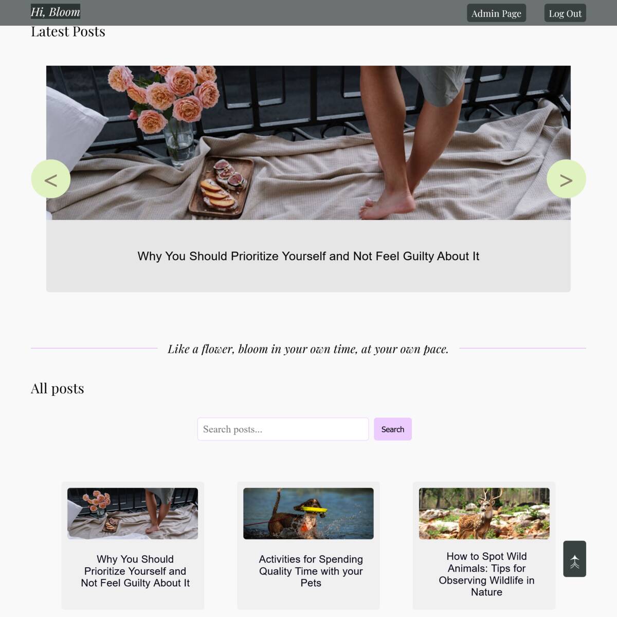
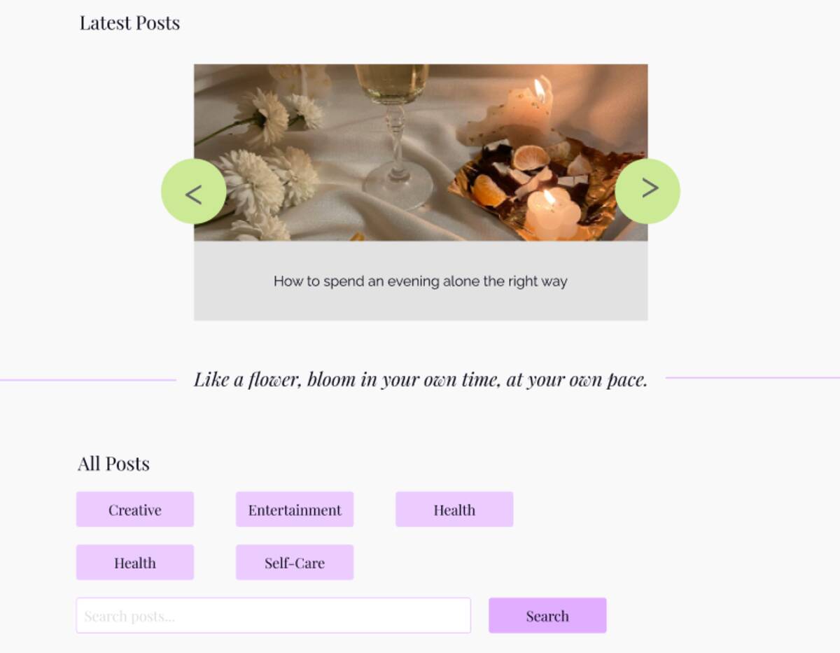
Interactive Carousel for Latest Blog Posts Displays the three most recent posts in an eye-catching carousel, optimized for performance with smooth transitions and lazy loading for images.
Dynamic Blog Post Management Integrated with an API that fetches blog posts dynamically, enabling real-time content updates and easy management of posts on the admin side.
Search and Pagination for Blog Posts: Users can search blog posts by tags or keywords, and pagination ensures they can easily navigate through older content without being overwhelmed by too many posts at once.
Responsive Design The site adapts seamlessly to various screen sizes, from mobile phones to desktops, providing an optimized and consistent experience across all devices.
Admin Page and Banner for Blog Post Management Allows authenticated users to create, edit, and manage blog posts easily with a user-friendly interface, including TinyMCE integration for rich text editing.
What I Learned
-
Login, Registration, and CMS Implementation: I gained hands-on experience in implementing secure login and registration processes, as well as managing user sessions. Developing the CMS functionality for blog post creation and editing was one of the most valuable aspects of this project.
-
Using TinyMCE for the First Time: I integrated TinyMCE to provide a rich text editor for the admin, enabling intuitive blog post creation. This helped me understand how to customize and implement third-party libraries effectively.
-
Manual Deployment During the Exam: I learned how to manually deploy the project while the exam was ongoing, which taught me a lot about handling version control, deployment processes, and troubleshooting on the fly.
-
New CSS Techniques: Throughout the project, I picked up new CSS tricks, from creating more efficient layouts to refining hover effects, improving both the aesthetic and functional aspects of the design.
-
Performance Focus: By optimizing image loading and improving performance, including implementing preloading techniques for the first time, I learned to balance functionality with speed, which ultimately enhanced the user experience.
Future Improvements
-
Adding Tags to Search Features: One key improvement I plan to implement is adding the ability to search by tags, allowing users to find content more easily by specific categories.
-
DRY CSS Principles: Through the project, I learned the importance of keeping my CSS as maintainable and DRY (Don't Repeat Yourself). I aim to refactor parts of the code to achieve even more efficiency in my styling.
-
Fine-Tuning Design and Functionality: While the design and functionality are fully implemented, there are a few areas I plan to revisit to improve user interaction, specifically around minor UI elements and refining responsiveness for certain layouts.
These improvements reflect my ongoing commitment to refining both the functionality and design of the Bloom platform.
Explore Bloom
Check out the live version of the Bloom platform or explore the source code on GitHub to see how it's built.